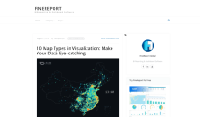
The words "geography" and "map" are commonly associated, largely because "map visualization is used to analyze and display the geographically related data and present it in the form of different map types." Readers interested in dabbling in data visualization and map making will enjoy this article, "10 Map Types in Visualization: Make Your Data Eye-catching," which covers some basic principles for...
"CyberGeography is the study of the spatial nature of computer communications networks, particularly the Internet, the World-Wide Web and other electronic 'places' that exist behind our computer screens, popularly referred to as cyberspace." The Atlas of Cyberspaces highlights many efforts from around the world to visualize this type of information. Some of the features have links to download...
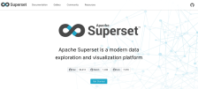
Apache Superset is a fast, lightweight, intuitive tool for users of all skill levels to visualize and explore data. The feature-rich, highly customizable, cloud-native tool is used by companies such as Airbnb, American Express, Lyft, Netflix, Shopkick, Twitter, and Yahoo!. Novice readers can use the interface to build appealing data visualizations from simple line graphs to interactive maps, all...
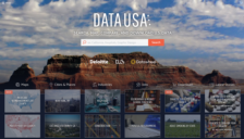
Data USA was launched in 2014 with the goal of providing visitors with helpful visualizations of data collected by governmental and non-profit institutions. The project is a partnership between the UK private company Deloitte, MIT Media Lab's Macro Connections group, and the web design/programming company Datawheel. Data USA is sleekly designed and easy to use: visitors can simply search for the...
Data visualization projects serve many purposes: a creative outlet, an information vessel, and often a combination of the two achieved by distilling complex information into fun, digestible infographics. The Scout Report frequently features top data visualizations; perhaps some of these annotations have sparked readers' interest in creating their own project. If so, the Data Visualization Society...
DebateGraph states, "to change the world you need to look at it in a different way." Many would agree; this platform gives multiple partners the ability to visualize and share different ideas. It's a neat concept and it's one that has been used by the United Kingdom's Foreign Office and CNN. A helpful "how-to" area can get users started and the application allows visitors to link ideas visually...
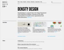
DensityDesign, a Research Lab at Politecnico de Milano, has mastered the art of visually presenting variegated social and organizational phenomena. As the site suggests, by "rearranging numeric data, reinterpreting qualitative information, locating information geographically, and building visual taxonomies, we can...describe and unveil the hidden connections in complex systems." From the homepage,...
FiveThirtyEight began in 2008 as an independent polling aggregation website. Founded by now-famous statistical analyst, Nate Silver, the site published articles accurately predicting several election cycles. The New York Times bought FiveThirtyEight in 2010 and sold it to ESPN in early 2014. These days readers can expect a punchy online magazine that dissects sports, politics, economics, science,...
For readers who love data - and the visual representation of data - this site from statistician Nathan Yau will provide hours of brainy entertainment. Readers may like to scout the site by Categories, such as Visualization (Seeing data), Statistics (Analyzing data), and Maps (Seeing geographic data), among others. They may also explore Recent data representations, which, at the time of this...
The primary mission of the Imaging Technology Group (ITG) is "to provide state-of-the-art imaging facilities for researchers at the Beckman Institute for Advanced Science and Technology and the University of Illinois at Urbana-Champaign." Its work includes visualization projects designed to complement a range of scientific fields and endeavors. In the Communications area, visitors can learn about...