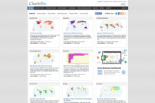
Interactive data visualizations are a powerful tool for quickly and clearly demonstrating complex topics. However, constructing such visualizations on a webpage can require significant coding ability. ChartsBin is a web based visualization tool that can be used without writing code. Visualizations created with the tool can be easily embedded in a website or blog, on social media, or even exported...
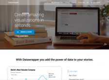
Datawrapper is a chart, graph, and map-making tool designed specifically to help journalists create clear, aesthetically appealing visuals. However, this tool is also useful for anyone looking to publish or embed data visualizations easily. Data may be added by either copying and pasting a Microsoft Excel document or by uploading a Comma-Separated Values (CSV) file. Next, Datawrapper instantly...
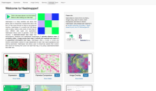
Heat maps use color to visually summarize information and make the relationship between data values immediately apparent. Heatmapper is a free data visualization tool that allows users to generate, cluster, and visualize five different types of heat maps: Expression, Pairwise, Image Overlay, Geomap, and Geocoordinate. Users upload their own data and can easily customize their heat map's appearance...
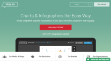
Infographics have become increasingly popular over the past few years, often presenting complex or text-heavy information in an easy to understand and visually appealing way. Among the numerous online tools and services out there, Infogram is especially handy for users interested in creating data-centric infographics, maps, and charts. User data may be uploaded as a .xls, .xlsx, or .csv file, or...
Jp is a command-line utility for generating quick visualizations of data. It can produce bar charts, line charts, scatter plots, histograms, and heatmaps from either JSON or CSV data. Users could employ tools like jq (featured in the 04-27-2018 Scout Report), pup (featured in the 04-11-2019 Scout Report), or csvkit (featured in the 01-31-2020 Scout Report) to extract data from online sources or...
Kingfisher is a visual mapping tool designed to quickly and clearly convey complex information in a graphical format. Kingfisher's design was guided by years of applied research on cognition and learning. Individual boxes can be added to specific concepts or tasks, with smaller concepts or sub-tasks grouped within them. Color-coded connections can also be added between related concepts. Users can...
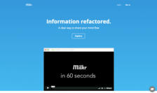
Milkr is a collaborative mind mapping tool that can be used to share thoughts and organize information. Users can create spider diagrams containing as many interconnected notes as they wish. Notes can be re-arranged in a drag-and-drop interface. The content of each note is edited with Markdown. Notes may also have attached files and images, inline images, embedded YouTube videos, and more. Other...
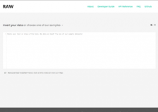
For users who are relatively experienced with spreadsheets (e.g. Excel, Numbers, etc.) but haven't taken the plunge into data visualization, Raw may be a good, user-friendly first stab at making your data visual. The process includes four relatively simple steps: first, copy and paste from your spreadsheet onto the Raw website; second, choose a layout and map dimensions; third, customize the...
Bridging the gap between data and design, RAWGraphs is a must-see for data visualization fans. Publicly launched in 2013 by the DensityDesign Research Lab (Politecnico di Milano), the tool provides an easy platform to input data and output impressive and easy-to-follow visual models. The main page of the RAWGraphs site outlines the basic steps for users, though before starting a new project, users...
Shiny's developers describe it as "an R package that makes it easy to build interactive web apps straight from R." Users need not have web development experience, nor do they need to write HTML, CSS, or Javascript. Instead, users construct the analysis and visualizations they desire as fairly standard R code from which Shiny will generate an interactive web version. In the Gallery section of the...