The True Size Of...
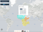
For the past several centuries, cartographers have tried to find different ways to portray the globe on a two-dimensional map. Many of these attempts, including the Mercator projection, distort the true size of different countries and regions. As a result, many of us have false perceptions about the proportional size of different geographical areas. This website, created by James Talmage and Damon Maneice, has one simple but important purpose: to enable visitors to compare the size of different countries and shapes and see how the Mercator projection has influenced our perceptions of country size. To use the tool, user must first type in a country or state to examine. From there, visitors can "move" this country around a Mercator map and superimpose it on any other region in order to make area comparisons. As users move each country across the map, the size of the country automatically adjusts according to lines of latitude. This adjustment demonstrates how the globe's spherical shape influences the apparent size of regions on a two-dimensional map. For instance, apparent country size is inflated near the poles and deflated at the equator.
Archived Scout Publication URL
Scout Publication
Creator
Publisher
Classification
GEM Subject
Language
Date of Scout Publication
May 5th, 2017
Resource URL Clicks
296
Comments