Refugee Flow
Many of our favorite resources this year combined data visualization, statistics, and storytelling to create projects that are equal parts attractive and informative. Refugee Flow, a site using interactive technology as a vessel for increased understanding and action surrounding migration and refugees, fits this bill. The site's ability to humanize statistics, along with its stunning visuals, brought it to the top of our list.
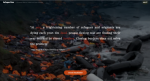
Refugee Flow is an interactive data visualization project that "examines one of the direct fundamental causes of the global refugee crisis, the collapse of order and stability in today's international landscape." On the main screen, featuring a striking 3D globe, visitors can explore the locations and fatality counts of armed conflicts worldwide for the years 2010-2018, with the ability to filter by region and quarter. This screen also provides a graph of total asylum applications from the region and year being viewed. Under the project's Route tab, visitors will find mapped representations of migrants' causes of death and injury along regional migration routes, accompanied by text and graphs summarizing each region's refugee situation, country-specific information on illegal border crossings, and links to data sources. This ongoing project integrates data from multiple sources, including the UNHCR Population Statistics Database and Armed Conflict Location & Event Data, to visualize "the impact conflict, persecution, and violence has on the lives of persons in their home countries and communities." Launched in July 2018, Refugee Flow was co-created by Will Su, a data visualization designer and coder, and Abin Abraham, a Web Development Coordinator at the United Nations Global Compact.
Archived Scout Publication URL
Scout Publication
Creator
Publisher
Classification
GEM Subject
Language
Date of Scout Publication
May 29th, 2020
Resource URL Clicks
352
Comments