The Scout Report -- Volume 27, Number 30

The Scout Report -- Volume 27, Number 30
July 30, 2021
Volume 27, Number 30

General Interest

Theme: Renewable Energy

Revisited

In the News

If you would like to make a tax-deductible contribution to support The Scout Report and the work of Internet Scout, please visit our donation page.

General Interest

Back to Top
Priority Setting Project Database
Science

When project resources are limited, where should researchers' priorities lie? The Priority Setting Project Database catalogs research articles that explore that question, with the goal of serving as a "source of inspiration," and a "research tool for unanswered questions and under-researched topics." The database includes sectors from agriculture to communication to law, although the bulk of the projects are in the health field. Examples of recent additions to the database include an article on prioritizing future research in vitiligo treatment and another on setting a research agenda for Latino childhood obesity in the U.S. The database currently holds 775 projects from around the world, which are searchable by topic, year, country, stakeholder, and research method. Readers can use the drop-down menus on the left side to filter their search. A summary of each project can be accessed by clicking "Show More." The database was developed by the Ludwig Boltzmann Gesellschaft Open Innovation in Science Center, which is funded in part by the Austrian National Fund for Research, Technology and Development. [HCL]

Comment on or rate this resource

Apache Superset
Science

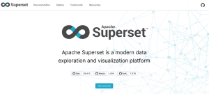
Apache Superset is a fast, lightweight, intuitive tool for users of all skill levels to visualize and explore data. The feature-rich, highly customizable, cloud-native tool is used by companies such as Airbnb, American Express, Lyft, Netflix, Shopkick, Twitter, and Yahoo!. Novice readers can use the interface to build appealing data visualizations from simple line graphs to interactive maps, all without the need for coding skills. Superset offers features that make it an asset for many types of projects, including the ability to design an interactive dashboard for data extraction, define custom dimensions and metrics, add custom visualization plugins, and configure detailed security and access rules. The tool is easily scalable and can connect to any SQL based datasource. On the homepage, users can click the "Get Started" button for an overview of how to use the tool and an FAQ, which can be navigated using clickable section headings in the left sidebar. The "Gallery" tab showcases examples of data visualizations created with Apache Superset. Users can check out the "Resources" tab for external resources and tutorials and a link to a GitHub repository (just click on "Awesome Apache Superset"). Apache Superset is a project of The Apache Software Foundation. [HCL]

Comment on or rate this resource

Voyageurs Wolf Project
Science

During the winter, wolves hunt in packs for moose, deer, and other large prey. In the spring, they give birth to pups. What do wolves do during the summer? That is one of the biggest knowledge gaps in wolf ecology, according to the University of Minnesota researchers behind the Voyageurs Wolf Project. For this project, researchers attached GPS collars to wolves in Voyageurs National Park in the northwoods of Minnesota to track wolves' predation and reproductive behavior during the summer, when wolves spend more time travelling alone or caring for pups. In one surprising finding, two wolves dispersed and met up again 5 months later and 186 miles away. Under the Photos & Videos tab, readers will not want to miss the "Animations" page, which features animated visualizations of these and other findings, such as the pack movements and wolves' dietary changes through the seasons. The Publications tab provides open-access PDFs of the project's peer-reviewed journal publications and links to popular press coverage. Under the About tab, users can click "About the Project" for more background information or "Greater Voyageurs Ecosystem" to learn more about the ecology of Voyageurs National Park and why it was chosen for this project. Readers hungry for new photos, videos, and project updates can keep up on Facebook, Instagram (@VoyageursWolfProject on both services), Twitter (@VoyaWolfProject), and YouTube. The project is primarily funded by the University of Minnesota and the Minnesota Environment and Natural Resources Trust Fund in collaboration with Voyageurs National Park. [HCL]

Comment on or rate this resource

We Count
Science

The needs of people with disabilities are often not captured in machine learning data, either overwhelmed by majority data or discluded as outliers. The team behind We Count includes AI professionals, disability activists, and scholars of disability studies who aim to develop data systems and machine learning strategies that include, understand, and serve people with disabilities and other marginalized groups. From the main page, readers can click on "Learn" to find journal articles and reports on AI and disability, ethics, and policy, as well as educational and methodological resources for AI professionals. The "Initiatives" section features free upcoming and archived workshops and webinars on data science and inclusive AI topics, such as "AI Hiring System Policies," and "Bias In, Bias Out." Readers can also access transcripts of most past offerings. We Count's YouTube channel (linked in the footer of the page) includes webinar recordings and other videos, most between 30 and 90 minutes long. We Count is funded by a grant from The William and Flora Hewlett Foundation and supported by the Accessible Technology Program, part of Innovation, Science and Economic Development Canada. [HCL]

Comment on or rate this resource

Smithsonian Gardens Virtual Tours
Social studies

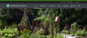
The Smithsonian's lush and diverse 180-acre educational gardens, which the institution calls a "museum without walls," are now accessible to all via an array of virtual tours. Casual flower fans and horticulture buffs alike can simply scroll the page linked above to appreciate the Smithsonian's magnolia collection ("Magnolia Madness") or see the best and brightest fall colors at any time of the year ("Fall Foliage Walking Tour"), among other offerings. For a deeper dive, readers can click "Be A Plant Explorer" to access a searchable guide to the Smithsonian Gardens collection, including high-resolution images, scientific information, and fun facts about each specimen (note that the tool works best on a computer or tablet). Garden geeks can show off with verdant digital backgrounds for computer desktop or Zoom, found in the Featured section at the bottom of the page. Readers can also follow the gardens on Facebook, Instagram (@SmithsonianGardens on both services), and Twitter (@SIGardens). The best part about the virtual gardens? They're always in full bloom. The only downside is trying to smell the flowers through your screen! [HCL]

Comment on or rate this resource

Theme: Renewable Energy

Back to Top
Today in Energy
Science

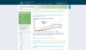
Today in Energy publishes one short, topical, data-driven article each day to help energy professionals and the general public keep up with the latest developments in renewable and nonrenewable energy. The report comes from the U.S. Energy Information Administration (EIA), and the articles are primarily U.S.-focused. Recent articles covered the impact of California's drought on the state's hydroelectric generation (July 7, 2021 issue), declining U.S. fossil fuel consumption (July 1 and 6, 2021 issues), and forecasting electricity disruptions in the U.S. this summer (June 30, 2021 issue). At the top of the page, readers can click "Prices" to see wholesale and retail prices for various energy products, updated each weekday morning. Readers can also find previous articles in the "Archive" or peruse articles by keywords such as Renewables, Exports/Imports, and Production/Supply ("Browse by Tag"). In the green menu on the left side of the landing page, readers can click "Email Updates" to sign up to receive Today in Energy in their inbox, as well as subscribe to other EIA newsletters on energy jobs, fuel prices, and region-specific energy news. Specialists working in energy may want to check out the EIA's YouTube channel (@EIAgov), where the organization posts recorded webinars and workshops for industry professionals. The EIA also shares highlights of their work on Facebook and Twitter (@eiagov on both platforms). [HCL]

Comment on or rate this resource

Renewables
Science

With our feet firmly planted on the ground, it can be challenging to see the global impact of our energy choices. Renewables, an open-source data visualization and narrative created by Ryan Hoffman, tells the story of the global spread of renewable energy resources from 1984 to the present. Readers can use navigation arrows to explore slides showing satellite imagery of the spatial distribution and growth of renewables. Slides in the visualization focus on specific types of renewable energy generation (wind, solar photovoltaic, and solar farms) and regions, with curated notes about what to observe. Renewables is a product of EarthTime, a project launched by the Community Robotics, Education and Technology Empowerment (CREATE) Lab at Carnegie Mellon University, in partnership with the World Economic Forum. EarthTime aims to "support positive future decision-making," through narrative animations of satellite imagery showing the Earth's natural and human-driven transformations. In addition to Renewables, users can click on the "Stories" tab along the top of the page to access more curated visualizations around themes including Mining, Pandemics, and Crisis in the Sahel. Readers looking for a deeper dive can use the "Data Library" to build their own visualizations with data from a wide range of sources, such as the U.S. Geological Survey, Google, and GlobalData. [MJZ]

Comment on or rate this resource

The Solutions Project: 100% Clean Energy Vision
Science

What would 100% renewable energy look like where you live? This interactive world map encourages readers to explore the possibilities of a green energy transition by laying out a projected renewable energy mix for the year 2050, including residential and commercial solar, wind, water, and geothermal energy. There are a number of ways to interact with the map. Readers can use the bar at the top of the map to toggle between "Countries," "Cities," and "U.S. states," then click on regions on the map for details. Alternatively, users can click "List" on the left side to scroll through different visions, from San Jose (26% solar plants) to Montreal (36% offshore wind). Each vision estimates the number of jobs that would be created, health and energy cost savings, lives saved by reducing air pollution, and other encouraging metrics. Even better, they can be downloaded as colorful PDFs, making it easy to teach and share. The Solutions Project also shares energy-related stories on its Facebook, Instagram, and Twitter pages (@100isnow on all platforms). Its YouTube channel hosts an eight-part series, "Climate Curious," exploring how climate issues intersect with antiracism, food and nutrition, student activism, policy, and more. The Solutions Project is funded by private, corporate, and institutional donors that are listed in the "Who We Are" section under "Our Funders." [HCL]

Comment on or rate this resource

Indigenous Clean Energy
Science

Readers interested in Indigenous and community-led clean energy projects, energy efficiency, and sustainable development should plug in to the Indigenous Clean Energy (ICE) Social Enterprise, "a pan-Canadian not-for-profit platform which advances Indigenous inclusion in Canada's energy futures economy through Indigenous leadership." ICE's programs include 20/20 Catalysts, a clean energy capacity building and mentorship program for Indigenous leaders; Generation Power, a career training program for Indigenous youth in the clean energy sector; and Bringing It Home, which empowers communities to build energy-efficient new and retrofitted homes. Readers can learn more about energy efficiency and housing in Indigenous communities by downloading Energy Foundations, accessible by clicking "Bringing It Home" on the menu at the top of the page. Through its international platform, "Global Hub," ICE advances the Three Island Energy Initiative to develop renewable power micro grids for Indigenous, coastal and island, and unelectrified communities that lack clean energy access. On the same page, readers can also check out the podcast Decolonizing Power, hosted by Mihskakwan James Harper and Freddie Huppe Campbell, two young Indigenous leaders in climate and clean energy. Each 30-minute episode features stories of community-led clean energy projects around the world. The podcast streams on most listening platforms. Users can click on "ICE Network" to connect with others, share knowledge, and join quarterly collaboration sessions. ICE also shares climate news stories and posts project updates on Facebook, Instagram, and Twitter (@IndigClnEnergy on all platforms). [HCL]

Comment on or rate this resource

Electricity Markets & Policy
Science

Electricity Markets & Policy (EMP) publishes independent, interdisciplinary analyses of technical, economic, and policy issues related to the U.S. electricity sector. Through publications, presentations, and direct technical assistance to states, the organization seeks to inform decision-makers in the public and private sectors about topics such as renewable energy, demand response in electric grids, electric system planning, electricity reliability and resilience, and energy efficiency. Readers can navigate the menu at the top of the page to check out EMP's reports and presentations ("Publications"); interactive visualizations, data presentations, and market reports ("Visualizations"); and recorded video webinars with links to accompanying reports ("Webinars"). Viewers may also use the "Research" dropdown menu to browse materials by topic. The "Tools" section provides energy professionals with a number of useful modeling tools. These include the FINDER Model for quantifying financial impacts of adopting distributed energy resources, the Resource Planning Portal database of long-term planning information, and the SUPRA Tool, a financial analysis tool geared toward island and remote communities. Readers can click "Mailing List" to sign up to receive EMP's reports and webinars in their inbox. EMP is a department of the Berkeley Lab, a U.S. Department of Energy National Laboratory managed by the University of California. [HCL]

Comment on or rate this resource

Revisited

Back to Top
National Energy Education Development (NEED) Project
Science

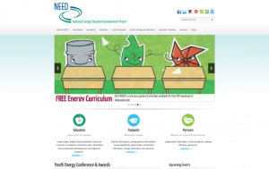
Educators incorporating renewable energy in the classroom should check out the NEED Project's curriculum resources organized around themes such as Energy Sources, Efficiency and Conservation, Climate Science, Geothermal, Hydropower, Solar, and Wind. Since it was last featured in the 07-20-2018 Scout Report, NEED has also added distance learning resources for digital classrooms.

Educators in many grade levels and subjects may be interested in the National Energy Education Development (NEED) Project. This U.S.-based nonprofit got its start in 1980 after National Energy Education Day was established to encourage schools to incorporate energy education into their curricula. Since then, the NEED Project has expanded from a one-day celebration to a comprehensive program whose mission is to "promote an energy conscious and educated society." NEED's website offers well over 100 curriculum guides and "infobooks" containing data-driven lesson plans and activities for K-12 students that are downloadable as free PDFs. These resources are organized thematically and by grade level, and they can be applied to multiple academic subject areas. Cognizant of the challenges teachers face, NEED offers curricula that correspond to the national Common Core standards and to each state's science standards, and some of their curriculum resources are also available in Spanish. Additionally, NEED hosts local professional development workshops for educators with free registration, and they also have opportunities for students, such as leadership awards and ideas for science projects. [JDC] [HCL]

Comment on or rate this resource

In the News

Back to Top
Fitbit Data Reveal Long-Term Effects of COVID-19

Fitbits Detect Lasting Changes After COVID-19 https://us.newschant.com/health/fitbits-detect-lasting-changes-after-covid-19/

Fitbit Data Points to Lingering Physical Changes for Some COVID-19 Sufferers https://gizmodo.com/fitbit-data-points-to-lingering-physical-changes-for-so-1847247248

Assessment of Prolonged Physiological and Behavioral Changes Associated With COVID-19 Infection https://jamanetwork.com/journals/jamanetworkopen/fullarticle/2781687

The next step for wearables could be illness 'warning lights' https://www.theverge.com/2021/6/15/22535204/apple-watch-fitbit-oura-wearables-illness-prediction

The Cruel Reality of Long COVID-19 https://www.nytimes.com/2021/03/22/podcasts/the-daily/covid-psychosis-mental.html

Can a Wearable Detect COVID-19 Before Symptoms Appear? https://detect.scripps.edu/

Data from Fitbit fitness trackers point to COVID-19 symptoms lasting for two to three months or longer, according to new research. The data come from a March 2020 study called DETECT that looked at whether Fitbit devices could identify COVID-19 in individuals. In a new paper, published in July 2021, researchers looked at Fitbit data from 875 DETECT study participants with respiratory symptoms, 234 of whom tested positive for COVID-19. Importantly, the study used both confirmed COVID-19 cases and those who were sick for other reasons in order to identify phenomena unique to COVID-19. Researchers found that those with COVID-19 experienced an elevated heart rate for an average of 79 days, compared to 4 days for participants with other illnesses. The longest effects occurred in 13.7% of COVID-19 cases, where it took about 4 and a half months for patients' heart rates to return to baseline. In addition, the data show that people slept less and were less physically active (measured by step count) than before having COVID-19. It took an average of 24 days for sleep quantity and 32 days for physical activity levels to return to normal. These data shed light on "long COVID," a collection of symptoms such as fatigue, "brain fog," shortness of breath, chest pain, melancholy, and headache that persist after typical COVID-19 symptoms have passed. The causes of "long COVID" are not yet known. The study also represents new progress in the use of wearable tech for health monitoring, especially for long-term symptoms.

In the first link, an article from NewsChant summarizes the methodology, main findings, and implications of the paper as well as plans for continued research into "long COVID." In the second link, Ed Cara of Gizmodo considers the symptoms and possible causes of "long COVID" and how data from wearable tech will gain importance in studying long-term health problems. Readers will find the full paper in the third link, published in the journal JAMA Network Open by Jennifer M. Radin, Giorgio Quer, Edward Ramos, and other authors. A story from The Verge in the fourth link looks at the opportunities and challenges of using wearable tech to detect illnesses such as the flu, Lyme disease, and Crohn's disease, as well as COVID-19, on both the individual and community level. Readers can learn more about "long COVID" in a 30-minute episode of The Daily podcast from The New York Times in the fifth link (there is an audio version and a written transcript). Finally, readers who wish to use their smartwatch or fitness tracker to help with future COVID-19 health studies should click the sixth link to join the DETECT study using the MyDataHelps app. [HCL]

PHPList msgid: 
1026